New web app UI/UX
In the graph below, can you please swap around the Temperature min and Temperature max readings? It is so confusing that the red line is above the blue line, but for the min/max readings the blue one is on top of the red one.
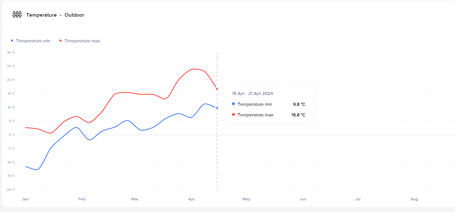
In the graph below, can you please swap around the Temperature min and Temperature max readings? It is so confusing that the red line is above the blue line, but for the min/max readings the blue one is on top of the red one.
<%= block.description %>
<% } %><%= block.description %>
<% } %>
Comments
0 comments