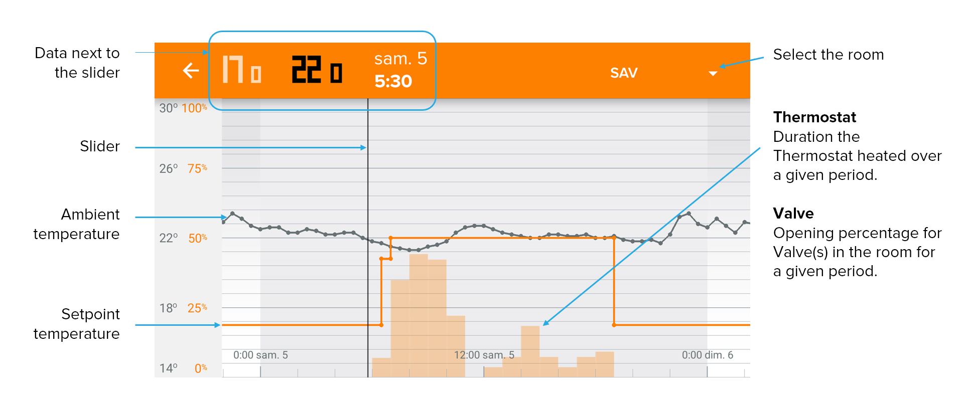
Several things are at the same time in the Energy app charts:

Setpoint temperature (orange curve)
This is the desired temperature based on the weekly schedule, predictive heating and overriding manual settings. In the mobile apps, the Setpoint curve is hidden automatically at a certain level of zoom to make it easier to read. To view it again, just zoom out by a pinch-open movement on the screen.
Example, for the heating of the Thermostat
In a one-hour period, if the bar is set at 50%, the Thermostat will heat for thirty minutes (not necessarily consecutive minutes) during that period.
Updated